Caslon is hard to lie to
SHARE
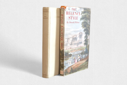
The font once cut by William Caslon I (1692–1766) still remains – despite all its imperfections and undisguised archaism – one of the main points of reference of Anglo-Saxon typography. As Robert Bringhurst wrote: “in the English-speaking world his typefaces have long occupied an unquestionable position, like the pipe and slippers, the good old car or the favourite armchair”. It is no wonder that Caslon is used by Whittington Press and the Italian Alberto Tallone Editore .
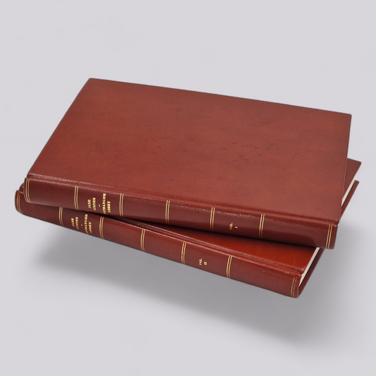
Rambler Press has been infatuated with Caslon since the very beginning of the press, when we first visited Whittington in 2012. A year later, in 2013, our first book, The Revival of Caslon Types by Justin Howes, was published. Since then, our affection for Caslon has remained the same. And it is no wonder, because as the poster published by Whittington Press says, “Caslon is hard to lie to.” Incidentally, it was printed for the Caslon Club, a secret group whose membership list was lost by its anonymous chairman.
In fact, one of the 60 copies went to Rambler. The entire run printed in 2009 has two different filigrees: "Jim" and "Dine." Ours is "Jim." The paper went to Whittington Press, after Petersburg Press closed in 1985.
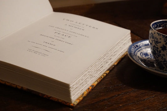
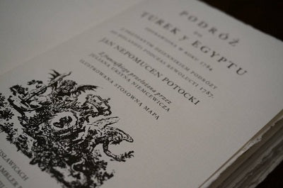
The main photo shows one of the first books printed by Rambler Press, “Podróż do Turek y Egiptu” by Jan Nepomucen Potocki (2015). Only a few copies (8?) were printed and bound in marbled leather and provided with Stanisław August’s super exlibris. The one shown in the photo is special, however; printed on Queen Anne handmade paper from John van Oosterom’s workshop. The name is not accidental: it is identical to the paper produced in the times of Queen Anne (1702–1714). The book was of course set with Caslon and with a “long s”. As the Master would probably have wanted.