Thames Font
SHARE
Founded by Thomas James Cobden-Sanderson around 1900 and operating until early 1917, Doves Press is one of the most important initiatives of its kind in the 20th century. Doves Press books were published with extreme restraint: most of them had the same format, binding and, finally, a font specially cut for this form. Their unique beauty was determined only by the paper, font and perfect printing. At a time when the crowning achievement of editorial taste seemed to be the works of William Morris and his Kelmscott Press drowning in refined ornament, this was a real challenge. "The paradox is that The Doves Press, with its simplest and purest style, was the product of more passion and thorough consideration than the rest [of the British publishing houses of the time] put together," wrote Colin Franklin in The Private Press (Dufour, 1969).
The legend of Doves Press was also enhanced by a decision made by Cobden-Sanderson in the last days of its existence. The creator of the press, a characteristic typeface modelled on Venetian fonts from the 15th century, drowned in the Thames at the end of January 1917, successively throwing in parcels weighing 12 kg from Hammersmith Bridge.
After a hundred years, however, a successful, large-scale search began at the bottom of the Thames. Fonts were found, on the basis of which Robert Green created an electronic version, Doves Type, which has been available on the market since 2016.
Doves Type fonts have so far been used in our work on two books: The Sonnets by William Shakespeare and The War with Catiline by Sallust.
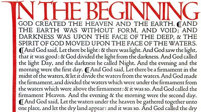
As a photo illustrating the text, we used a fragment of the first page of the Bible , published in five volumes by Doves Press in 1903–1905. Today, the Bible reaches prices of $10,000–20,000 at auctions.
It is worth taking a look at the short BBC film showing the history