Return to Turkey and Egypt
SHARE
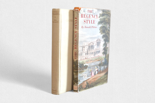
In 2015, we prepared for publication Podróż do Turke y Egiptu by Jan Nepomucen Potocki, based on the first Polish edition, which appeared in the translation by Jan Ursyn Niemcewicz at the Wolna Printing House in Warsaw in 1789. The book, which we have already written about here , was set in the Caslon font, with a “long s”, like its original.
Except that the then edition of Podróże … was already a certain archaism, proving a certain backwardness of Polish printing. The 1780s were the era of an extremely dynamic revolution in European typography, the clearest proof of which is the abandonment of the “long s”. The first attempts appeared in the late 1750s, and in the 1770s this process gained momentum. Joaquín Ibarra (1725–1785) published his books in Madrid without the “long s”; in Italy Giambattista Bodoni began printing in this way around 1778, and in France François-Ambroise Didot abandoned the “long s” in 1780. Even in conservative England, the fonts cut for John Bell and William Bulmer in the second half of the 1780s were already devoid of the “long s”. Although it must be admitted that in this country this symbol survived for a long time, until the first years of the 19th century.
"Vellum" paper, or simply smooth paper, was also becoming more widely used, replacing the previously common ribbed paper. The first books on such paper appeared in Great Britain as early as the second half of the 1750s, in France a little later, around 1780. We can be sure that Potocki, who was keen on all sorts of novelties and regularly corresponded with Firmin Didot, was aware of the changes taking place in European typography. Although he himself, in his Free Printing House, did not introduce them.
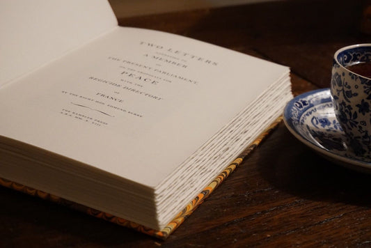
So when it came time to tackle Potocki’s book again, the idea of republishing it with a “long s” was rejected out of hand. Instead, we decided to try fonts that were fashionable in the 1780s. Our first impulse was to reach for fonts based on Didot’s fonts. To tell the truth, our attempts were not particularly encouraging. So we decided to go with Bodoni’s fonts, which was all the easier because the Parma master had one work printed in Polish: The Temple of Venus in Cnidus , published in 1807.
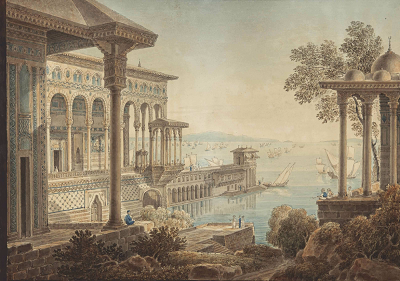
As illustrations, we used the works of Louis François Cassas (1756–1827), a French traveller and illustrator contemporary to Potocki. Although his travels did not coincide with the story contained in Travels …, it nevertheless beautifully reflects the world that Potocki also saw in 1784.
Finally, paper. Here, the choice was simple, contrary to appearances. We reached for cylindrical, cotton paper from a workshop once owned by the Johannot family of Annonay, which was used not only by François-Ambroise Didot, but also by the Montgolfier brothers.
In a word, we hope that this edition will be more reminiscent of the tastes of Count Jan's era.